BC Enrolment Dashboard
User Experience / Data Visualization / Web Development
Overview
Completed for an internship with the BC Ministry of Education (Education Economics and Data Science Lab). The BC Enrolment Dashboard is a web(mobile friendly) dashboard that helps users to quickly explore historical enrolment data (BC public schools), better understand the enrolment trends and impact metrics, and make informed decisions.
Role:
UX design, data visualization design, data wrangling, web development
When:
2019.05 - 2019.08
Team:
A solo project, designed and developed from end to end
Objective - Paving the last mile
"Efforts fall short in the last mile, when it comes time to explain the stuff to decision makers." - Scott Berinato
With increased data inquiries and questions regarding student enrolment, in addition to the comprehensive enrolment report (160+ pages) created by the analytics team, a more consumable and flexible solution is needed to explain and share complex results with different stakeholders, enable the Ministry's executives and school boards to capitalize on the insights and allocate funds and resources accordingly for all public schools in BC.
Getting to know the data
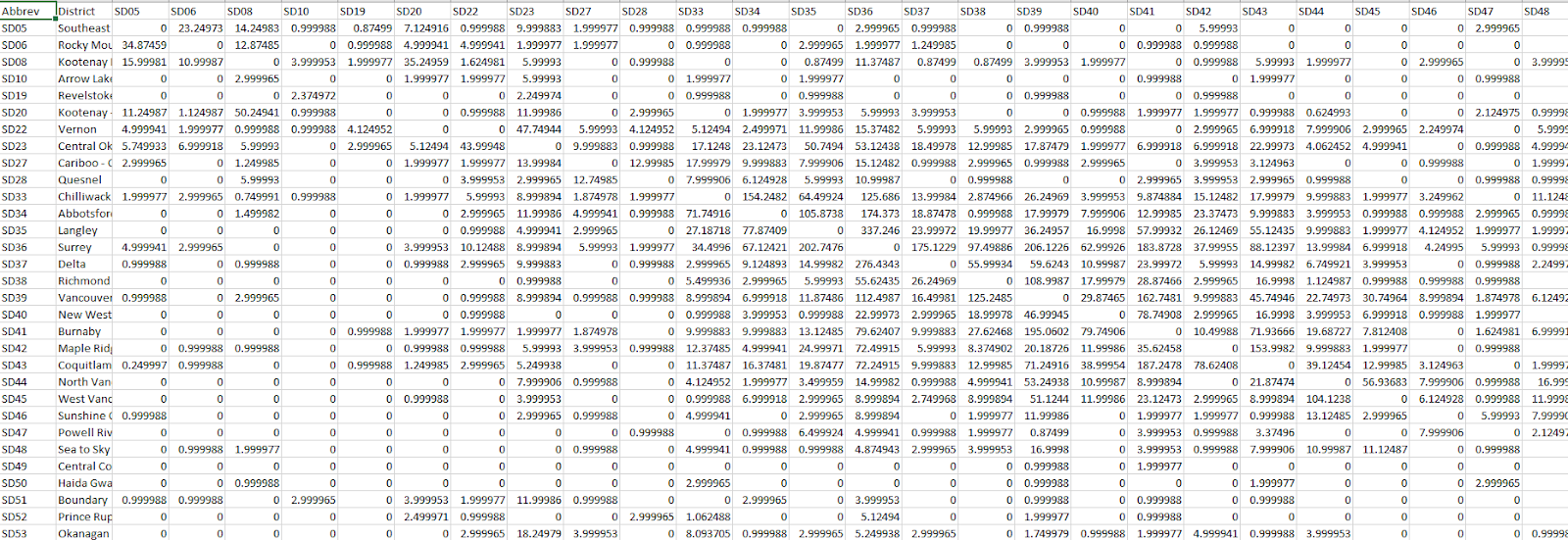
I started by diving into the 2018/2019 BC School Enrolment Report (a static report created by our analytics team), with the basic understanding of impact metrics (e.g. demographics, migration, retention, and transition) and their correlations, as well as jargons like 'funded FTE', I then began to explore the enrolment database by writing various SQL queries for each key driver to understand the data better. I also reshaped the data needed for each visualization.
Exploration
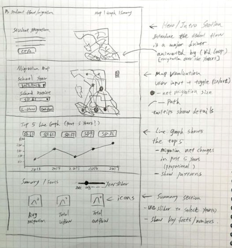
During the design process, I explored different visualizations for numerical, categorical, and geological data , and I strived to present the data as stories by including data insights on both provincial and district-level. After sharing sketches and receiving feedback from my colleagues, I created high-fidelity mockups and started the development process.
Working dashboard
Enrolment model
When the user first uses this dashboard, an overview of the Enrolment Model illustrates the four main drivers and let the user explore their correlations and impact on enrolment on student enrolment.
Demographic types & comparison
The demographics section is where the user can select different demographic types, school district(s), and compare demographic data of different districts as well as of the province. A multi-line graph is appropriate for comparison and presenting historical trends.
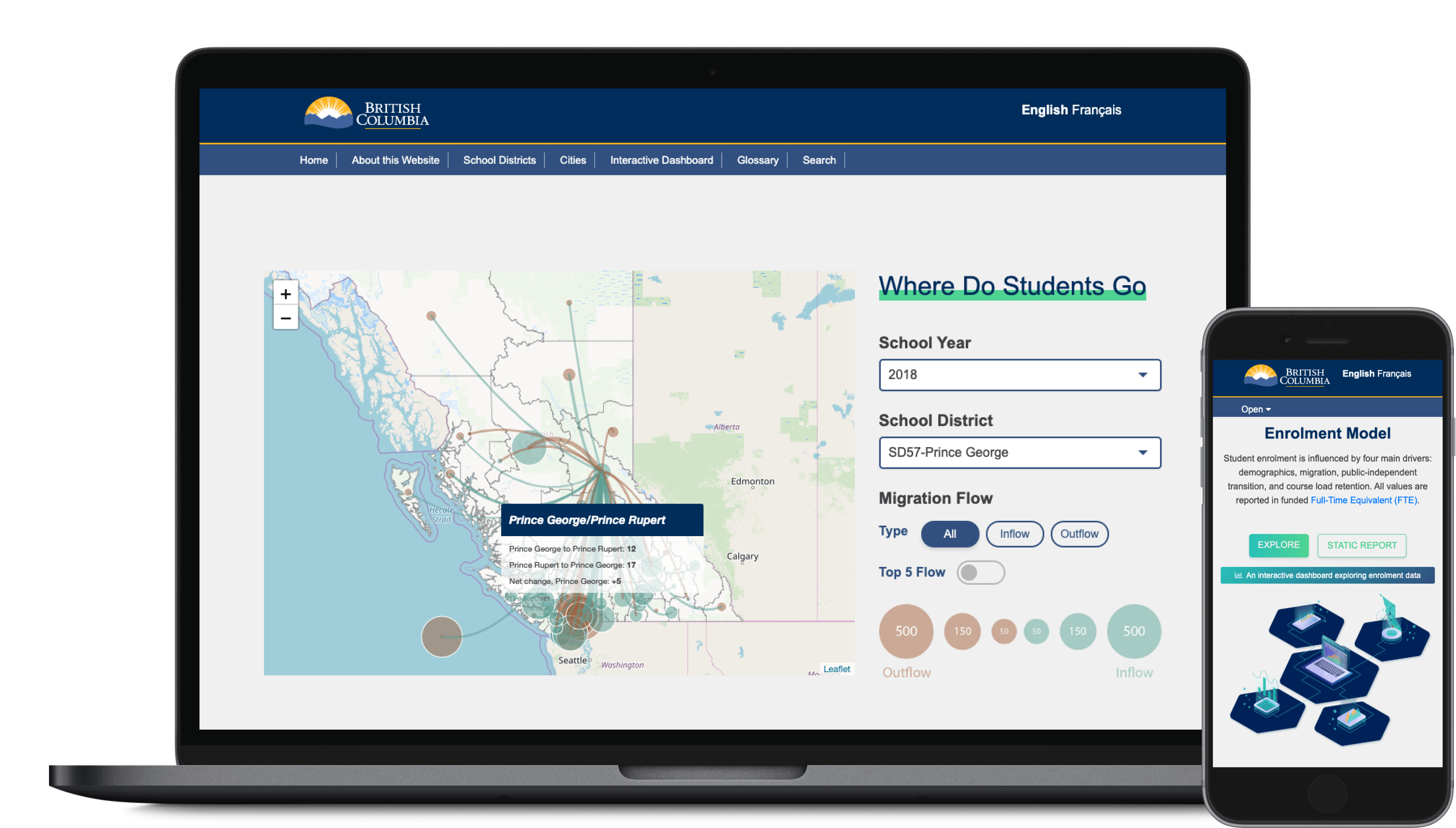
In-depth exploration - student migration
When showing the intra-provincial student migration, I felt that it wasn't enough to simply show the net migration of a district. I really wanted to show the context of the direction of migration, the scale within surrounding districts and the province, to give users more holistic information of the selected district.
I also added the top-5 filter so that the user gets insights on which surrounding districts most of its students are moving to and where most of its inflow students are from.
Public-independent transition and beyond
This section of the dashboard shows the number and percentage of students move between independent schools and public schools. I've provided both provincial and district level charts.
The scatter plot is generated by the number of students transferred and total enrolment number of each district, and it also links to other relevant information such as the Foundation Skills Assessment result and Student Satisfaction report of each district. This helps users synthesize information and get more insights regarding student transition.
Outcome and reflection
The dashboard is now live and introduced to 60 public school districts as a part of the BC StudentSuccess website. It was definitely a challenge trying to close the communication gap between complex analysis and various end-users. I learned to leverage the data resources and my skills accordingly to realize our vision and tell effective data stories. I also learned a lot regarding statistical and analytical thinking from my colleagues.